Re: Photography

I'm going to give my opinion on each image in order, with a semi-colon to separate each one. If I seem a bit harsh it's because I think that have some real talent and want to give you my honest opinions in hopes of helping you grow as a photographer, and remember that they're just my opinions.

As far as wildlife photos go it's not really all that interesting, the framing is simple and the selective color really takes away from the subjects and makes me focus on the boring grass; this is a really nice image, it's framed beautifully and the gradient of colors is great, really nice work here, more of that; framed well (puns) but I think it would do better in black and white, there's some really nice detail that would be brought out nicely in grey scale that you lose in color, and the colors are boring anyway, occasionally try switching your pictures to black and white, you might be surprised by the result; I like that you made if feel vintage, it defiantly makes me look at the image more than I would otherwise; this is very much a beginning photographer looking photo, it looks a lot like the pictures I used to take, it's a well presented picture of a statue, good for remembering a vacation, not much else; very good choice for selective color, it would be even more stunning if you could get rid of the red reflection on the white wall, but regardless a very pretty photo; assuming you did some photoshop work on this, it's your best one so far, the framing is very nice, and the ladybug is super sharp, very powerful image; over saturated, I actually would like to see this in black and white, it think it could be interesting; again, definitely stronger in black and white.

Re: Photography

Wow, thanks for that great post, backyard.

I agree with most of your comments, but I don't really understand this one:

backyardlegos wrote:

again, definitely stronger in black and white.

Stronger? I don't think so. In my opinion, the colors of the last picture are really important. Look at the blue and the yellow, it reminds me of Gladiator.

Again, thank you. I'll try to improve the over saturated picture.

Re: Photography

Here are some of the better photographs I've taken recently-

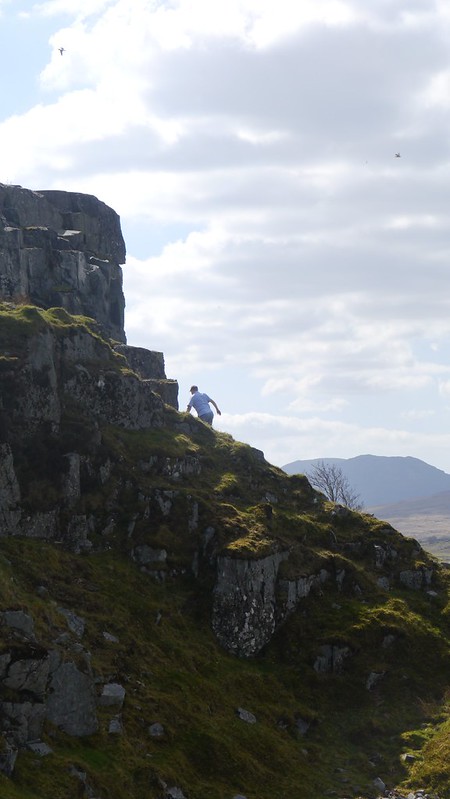
https://farm3.staticflickr.com/2907/14187275835_9aa76fb614_c.jpgThe Lost World

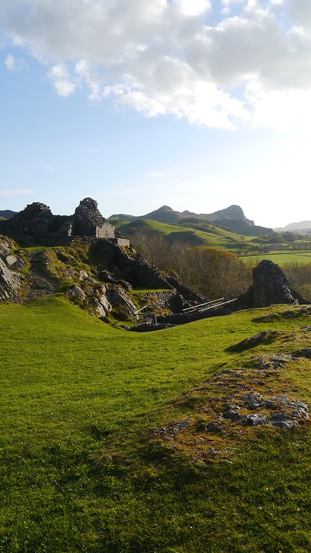
https://farm8.staticflickr.com/7414/14000603257_0c16e252da_c.jpgCastell y Bere

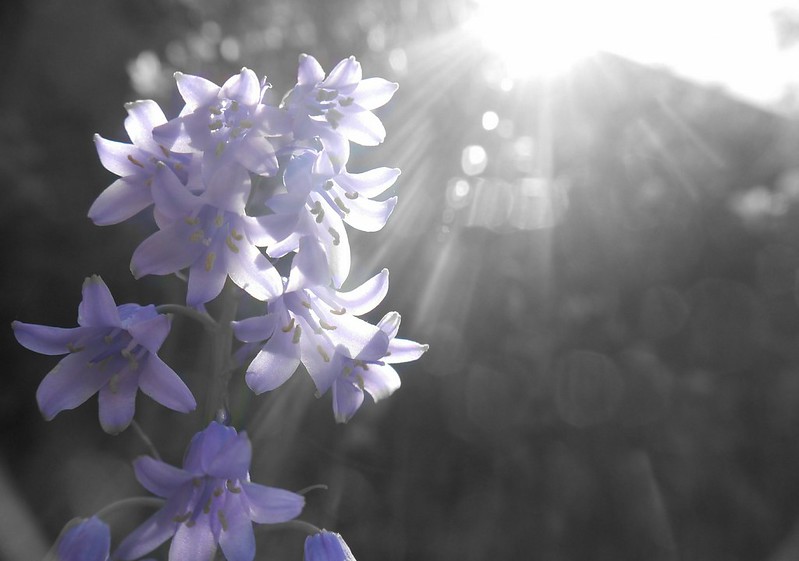
https://farm8.staticflickr.com/7444/14183814341_faa8a0be5e_c.jpgA purple bluebell by --Jayem--, on Flickr

Also, does anyone have any advice on generating followers and such on Flickr? I'm not looking to gain a massive number or anything, but it would be nice to get some feedback on photos I upload.

Re: Photography

/

Last edited by Legocloniac477 (April 30, 2021 (02:22pm))

"I wear black even when I'm not animating. I'm like a walking funeral parlor."
-PushOverProductions

Re: Photography

Nice shots, Cloniac! I really do like the quality of each photo and the atmospheric feel that you've established.

Have you seen a big-chinned boy?

Re: Photography

I like your pictures, Legocloniac mini/wink

However, there's a lack of contrast in shots 3 and 4.

Re: Photography

Loïc F-B wrote:

However, there's a lack of contrast in shots 3 and 4.


Yes, there is.

"I wear black even when I'm not animating. I'm like a walking funeral parlor."
-PushOverProductions

Re: Photography

Wow, Loïc F-B, I really like those mini/smile
I'm often not too into the whole spot coloured or masked photography but these are great. Especially the Japanese Maple and the ladybird with the background colours tuned down.

@Legocloniac477
I also like these images; the pond one particularly catches my eye although the horizon isn't completely straight. I think it's the subtle colours that catches my eye.

Last edited by animationIsaac (June 6, 2014 (11:40pm))

Re: Photography

Is there a rule about not under-contrasting photographs? I never took lessons or photography classes so I would say that I don't know the majority of rules. When I was editing the pictures I was thinking it was a kind of style difference, but now I'm starting to wonder if that's true.

I used to be a below novice magician, and a website that sold the magic tricks had trailers for their tricks (cards tricks, card flourishes, general tricks, ect...). The trailers had this un-contrasted "style" to them and it really intrigued me, so I tried to apply that here.

"I wear black even when I'm not animating. I'm like a walking funeral parlor."
-PushOverProductions

Re: Photography

Legocloniac477 wrote:

Is there a rule about not under-contrasting photographs?

In my opinion, there are no true rules in photography.

Yes, there are guidelines, like the rule of thirds, but they're just tools to achieve what you want.

By the way, here's a fish:

https://farm4.staticflickr.com/3864/14386260373_1ef5294cfc_h.jpgRed lionfish by Iconograff, on Flickr

Re: Photography

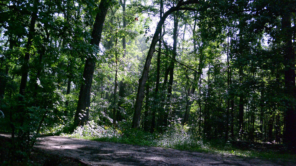
This picture was taken at night.

https://farm6.staticflickr.com/5480/14224038440_ff2d259e99_b.jpg

Since a heliophobe like me can't usually take picture of nature during the day, I went and took a long exposure shot of a moonlit forest at a nearly full moon for over four minutes.  The end result looks almost indistinguishable from daylight.
However, at night there is sometimes a certain mist in the air which the sun usually dismisses, but here that subtle mist is still present.

Re: Photography

That's impressive, Squid. If you look closely you can see the moonlight is slightly colder than sunlight, but I'd have no idea if you hadn't said.

Playing around with some Google+ Photos adjustments. Very impressed so far.
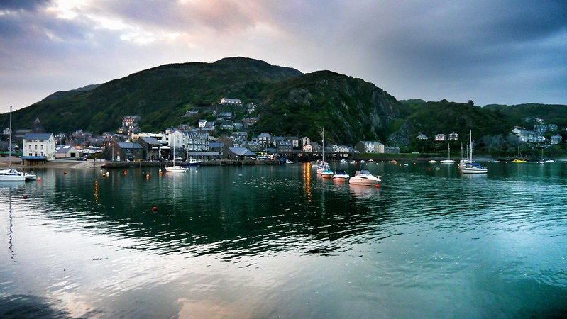
https://farm4.staticflickr.com/3851/14153007810_73506f58e8_c.jpgBarmouth by --Jayem--, on Flickr


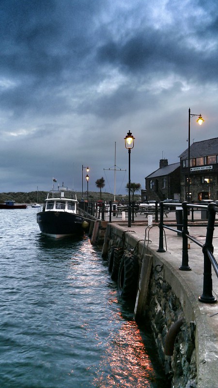
https://farm3.staticflickr.com/2924/14412363934_f81355c47e_c.jpgBarmouth Harbour by --Jayem--, on Flickr

Re: Photography

Great photos, Jayem and Squid.

Jayem wrote:

If you look closely you can see the moonlight is slightly colder than sunlight, but I'd have no idea if you hadn't said.

It all depends on the white balance mini/wink

Re: Photography

Maine...

https://farm3.staticflickr.com/2925/14557260092_e76aa86ecd_h.jpgSurrounded by Iconograff, on Flickr

https://farm6.staticflickr.com/5516/14535028516_f49bb7c261_h.jpgThe Dock by Iconograff, on Flickr

https://farm4.staticflickr.com/3898/14371504969_c5f1acb05b_h.jpgReverence by Iconograff, on Flickr

https://farm6.staticflickr.com/5559/14563971134_3af34d8ccf_h.jpgPortland Head Light Reflection by Iconograff, on Flickr

Re: Photography

Those are really amazing Loïc, I especially love the last photograph.

"I wear black even when I'm not animating. I'm like a walking funeral parlor."
-PushOverProductions

Re: Photography

This is my favorite picture I took while on vacation in Manasota Key, FL. My internet is too slow to post a preview in the msg body, so here's the Flikr link: https://www.flickr.com/photos/116666602 … 583848338/

Twitter | Instagram | YouTube Channel | Tumblr | My Weekly Film Podcast!
"For I am NOT ashamed of the Gospel of Christ" - Romans 1:16

Re: Photography

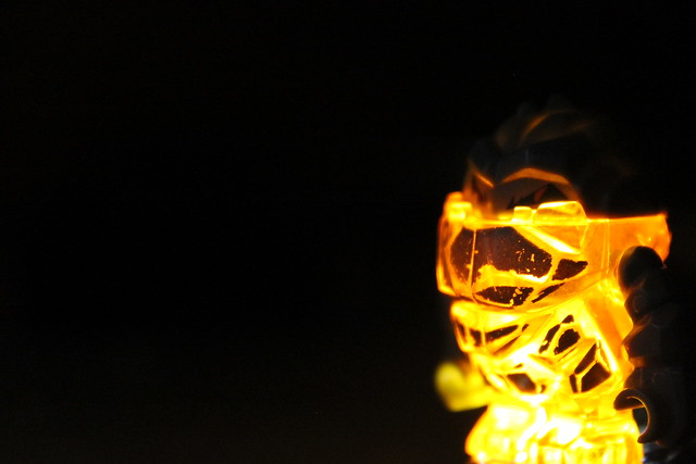
Did this experimental shot today:
https://farm6.staticflickr.com/5577/14649401919_0cd39b1437_z.jpg

Re: Photography

Very nice effect, though I think the use of black space is a little too extreme.

Re: Photography

Jayem wrote:

Very nice effect, though I think the use of black space is a little too extreme.

I realised. Initially, I tried to edit the glow, so it would seem like the black would've had more of an orange glow through it! Thanks for your response! :·)

Re: Photography

I'd concur.
I feel like little rocky should be slightly higher and the frame and slightly less to the right.  Also, I feel like this would benefit from a little bit of white light shining from somewhere behind the monster (but not into the camera) and highlighting some of the edges of his rocky little head.  Perhaps with slight bit of a blueish hue to that mostly white light.
Also, the depth is rather low, and you seemed to have focused more upon his chin when the place betwixt his eyes might've been a better choice.

It's cool the way he glows, though.