Re: Sets and Props Critique Thread

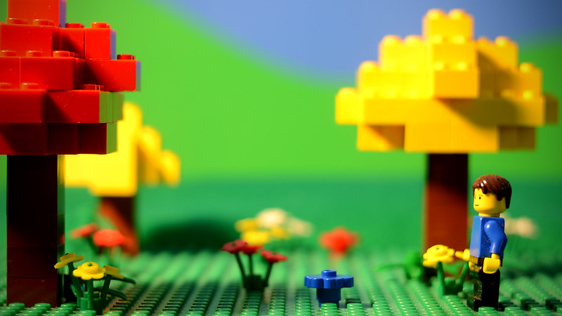
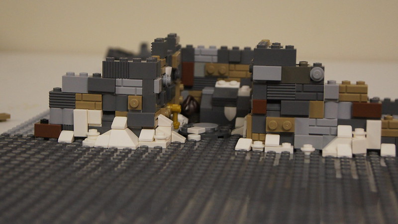
That looks very nice. I really like the size of it, the detailed trees. My only critique would be that the sky looks rather brick-ish mini/wink  in my opinion it makes sets look like there in a box. But I know that thats way way more of a opinion than a helpful tip. If thats the stile your going for I'm all for it. Over all that looks really amazing especially for a first actual brick film set.

Hope that helps
OsomStudios

This world is a dark place. One day I will see my Savior face to face.
My Youtube

Re: Sets and Props Critique Thread

Impressive scale; love the cliff!

https://vimeo.com/channels/holdingourown      http://holding-our-own.tumblr.com

"None practice tolerance less frequently than those who most loudly preach it."

Re: Sets and Props Critique Thread

Setting up for Vampire Booze. Ignore the background, as I'm not sure how I'm going to do the sky yet, and I haven't shown part of the left of the set yet because I have yet to print out the backdrop I've made for the wall, but this is 90% of the set. The basic structure is the same as the set from Vampire Owls, but I've redecorated and refloored it to be the drink cellar of the Scottish Vampire. I was originally going to have a whole tartan carpet but I only had enough of the right tiles to do that square in the center of the floor.

As far as lighting goes, I'm still working that out too. I'm not entirely sure yet how I want to light it, but a lot of that depends on how I do the sky outside.

https://farm8.staticflickr.com/7399/16411290215_86ab88e5fa_b.jpg

http://www.brickshelf.com/gallery/ZoefDeHaas/stuff/sig1.png
"Nothing goes down 'less I'm involved. No nuggets. No onion rings. No nothin'. A cheeseburger gets sold in the park, I want in! You got fat while we starved on the streets...now it's my turn!" -Harley Morenstein

Re: Sets and Props Critique Thread

The clutter is well done, and I like the use of the Harry Potter stone.  However, the carpet feels misplaced.  Perhaps instead try using some less colours.
The brown of the rest of the floor might also be better in dark grey as so there is not too much brown in the shot.

Re: Sets and Props Critique Thread

I did try the floor in dark grey, but it didn't look quite right - the dark grey on the walls is old grey, whereas the only dark grey plates I have with me are that bluish new dark grey. I also don't have any darker reds or greens to use.

http://www.brickshelf.com/gallery/ZoefDeHaas/stuff/sig1.png
"Nothing goes down 'less I'm involved. No nuggets. No onion rings. No nothin'. A cheeseburger gets sold in the park, I want in! You got fat while we starved on the streets...now it's my turn!" -Harley Morenstein

Re: Sets and Props Critique Thread

The lighting combined with the background setup put this shot a little off-balance, having more light on the left side. If the character/focus is going to be on the left line following the rule of thirds, then I think the shot will look great. Otherwise, I'd advise adjusting the lighting, or taking out whatever creates most of the shadow on the right side.

Re: Sets and Props Critique Thread

Something I put together for the last scene to be shot.  It's just a test photo, so the quality isn't that great, but you get the picture of part of the set.  It's actually larger.  The 10 means 10 items of less, not lane 10

http://36.media.tumblr.com/12534698c43e4295c4fde6cac447345b/tumblr_nj5iy2Y3IR1risd4oo1_500.jpg

https://vimeo.com/channels/holdingourown      http://holding-our-own.tumblr.com

"None practice tolerance less frequently than those who most loudly preach it."

Re: Sets and Props Critique Thread

It's nice, but I'd be wary of having the yellow stacked up right behind the mini figure, with his yellow face they blend together a bit. Just a small observation.

Re: Sets and Props Critique Thread

Looks really nice. Your set building is getting really good. I really like the door and window. The only thing I might suggest is to smooth out the shelf thing and the brick on top of it. But over all I really like it.

Looks really good
OsomStudios

This world is a dark place. One day I will see my Savior face to face.
My Youtube

Re: Sets and Props Critique Thread

Jayem, I used yellow cans because there's a similar display in another scene, and I just wanted to put in there to thematically link the two scenes together.  I already shot the scene, but I don't think it gets too much into the cashier's face.  The minifigure in the picture is actually a stand-in!

osom studios, good suggestion, but this is an early picture.  After this photo was taking and before shooting, I filled those shelves (and the brick on top of it) with 1x1 round plates to represent candy.  But I'm kind of a fan of exposed studs so if those shelves were going to remain blank, I'd have removed the top brick and probably left the other shelves' studs exposed.

Jampot, I don't know.  I kind of like the brown in the floors along with the brown items.  I think it's fine as it is.

https://vimeo.com/channels/holdingourown      http://holding-our-own.tumblr.com

"None practice tolerance less frequently than those who most loudly preach it."

Re: Sets and Props Critique Thread

rioforce wrote:

I have no idea if this is the right place to put this, because this topic is in the Bricks section, but mine relates more to non-brick aspect of the set design.

https://farm9.staticflickr.com/8583/16197669150_754beb2d52_c.jpgHills Backdrop Test by rioforce, on Flickr

I am trying new techniques for brickfilming, and this is one of them. I was inspired by the simplistic set designs of Rudolf the Red-nosed Reindeer and other old stop-motions like that. So this is a test of my new backdrop. Basically, instead of using only a blue posterboard for the sky, I am using a green cutout that looks similar to hills in the distance. Unfortunately, it does not match the green of the baseplate and felt (which is used for that closer hill).

Comments are appreciated! mini/smile

Very atmospheric! How did you do that backgournd?

Re: Sets and Props Critique Thread

so, Im also posting this here:
https://fbcdn-sphotos-c-a.akamaihd.net/hphotos-ak-xpf1/t31.0-8/10981062_599936820106690_4974597603937782835_o.jpg

aside from the walk way being all waving, what do you think? its a alantian throne room

Re: Sets and Props Critique Thread

Cooked Cat wrote:

so, Im also posting this here:
https://fbcdn-sphotos-c-a.akamaihd.net/hphotos-ak-xpf1/t31.0-8/10981062_599936820106690_4974597603937782835_o.jpg

aside from the walk way being all waving, what do you think? its a alantian throne room

Awesome! I always imagined Atlantis as a happy Kingdom where mermaids happily swim around as King Aquaman talks to fishes. Never thought it would be dark and stern, but you have successfully pulled it off. I am not a fan of Aquaman but I'm pretty sure it'd be better than "Throne of Atlantis".
The blue floor lighting is amazing.
This is a sets and props critique, my critiques are:

  • Aquaman's throne is too curvy

  • it doesn't look like a room, by that I mean it has no walls, no pillars. It looks like his throne is in the middle of Atlantis

  • The walkway looks as if there are too many studs (I'm pretty sure they're studs, correct me if I'm wrong).

Not-Mod-Edit: Is it for the next DC movie?

Last edited by Kd2000 (February 6, 2015 (03:27am))

Youtube

my dad doesn't want me to brickfilm on because it's his computer, but he's not home right now at the moment.
-FilmyGuy1

Re: Sets and Props Critique Thread

thank you for your feedback KD-OVER9000000! I didnt really look at much sauce material! oops! so, more like:
http://serpentorslair.com/wp-content/uploads/2014/10/GalleryComics_1900x900_20140514_AQM_v4-Cv_533f3cbb228e07.95129419.jpg
I was kinda thinking of having it like having a forcefieldy thing around it, and given alantis is still protected by a bubble in this series.... that make sense?
ok, so, less studs, you mean either side of the walk way? I can do that!

Re: Sets and Props Critique Thread

That's impressive.  It reminds me of the Iron Throne.

Re: Sets and Props Critique Thread

This looks epic! My only suggestions are that maybe you could have some statues or pillars either side of the walkway. I always imagined the DC Atlantis kind of how it appears in Injustice: Gods Among Us.

http://gamerhorizon.com/wp-content/uploads/2013/04/Injustice-Gods-Among-Us-frost-and-ares.jpg
http://fc07.deviantart.net/fs70/f/2014/169/2/4/ssbb_stages___injustice_gau__atlantis_stage__wip1__by_dsx8-d7mxv4h.png

http://www.brickshelf.com/gallery/ZoefDeHaas/stuff/sig1.png
"Nothing goes down 'less I'm involved. No nuggets. No onion rings. No nothin'. A cheeseburger gets sold in the park, I want in! You got fat while we starved on the streets...now it's my turn!" -Harley Morenstein

Re: Sets and Props Critique Thread

it was kinda based partly of the Iron throne.... I'll have a think about the redesign, so, what I need is:

  • more of a 'wallish' thing signaling the end of the set and the start of the window.

  • statues, pref 4 or 6?

Re: Sets and Props Critique Thread

https://farm8.staticflickr.com/7391/16272515148_669a861c51_c.jpgNorway Porp Pic #1 by Galactic Bricks, on Flickr

Here are a few more pics of the set:
https://www.flickr.com/photos/100439334 … 272515278/
https://www.flickr.com/photos/100439334 … 272515578/
https://www.flickr.com/photos/100439334 … 272515678/
https://www.flickr.com/photos/100439334 … 272515798/

I'm trying to depict a street with a short ally. My scene is set in Norway, which is why there is snow on the ground. What do you guys think? Too much detail or not enough?

Re: Sets and Props Critique Thread

Looks nice. As long as you can tell that it is an alley, and all the detail doesn't distract, then it's great.

YouTubeWebsite
https://bricksafe.com/files/rioforce/internet-images/RioforceBiMSig.png
"Whatever you do, do all to the glory of God." - 1 Corinthians 10:31b

Re: Sets and Props Critique Thread

Cooked Cat wrote:

I was kinda thinking of having it like having a forcefieldy thing around it, and given alantis is still protected by a bubble in this series.... that make sense?

Force field eh? That's unique.

Cooked Cat wrote:

ok, so, less studs, you mean either side of the walk way? I can do that!

That will be nice but not exactly what I meant. The wavy walkway looks a bit odd to me. I'm not sure if it was made that way in post-production or if it is just simply lego bricks, but it looks like a cobblestone path.

Galactic Films wrote:

I'm trying to depict a street with a short ally. My scene is set in Norway, which is why there is snow on the ground. What do you guys think?

It looks like a tonne of bricks put together but in a good way. Just like the UCS tumbler.
I wouldn't say it lack nor exceeds in details. More or less, it still works.
As for the alley, it looks quite nice.

Youtube

my dad doesn't want me to brickfilm on because it's his computer, but he's not home right now at the moment.
-FilmyGuy1