Re: Critique My Frame!
think so, those bricks can look very green... ![]() thanks guys, heres another one:
thanks guys, heres another one:
seems that over-exposure is a likely issue I will have to battle with a bit....
atleast this frame is free of it:
We are a friendly filmmaking community devoted to the art of stop-motion animation using LEGO® and similar construction toys. Here, you can share your work, join our community of other brickfilmers, and participate in periodic animation contests!
A place to discuss, share, and create stop motion films.

Ad
You are not logged in. Please login or register.

think so, those bricks can look very green... ![]() thanks guys, heres another one:
thanks guys, heres another one:
seems that over-exposure is a likely issue I will have to battle with a bit....
atleast this frame is free of it:

A frame from my upcoming release. Thoughts?

Interesting, and vERY widescreen. The rain looks a bit sketchy, if it's drawn, I'd make it slightly thicker and feather it down to size. The placement of the character is dramatic and I see a clight vignette on the frame. Are you shooting in color and removing the color, because I see a bit of bluish to the gray, the way old movies look.
Interesting, and vERY widescreen. The rain looks a bit sketchy, if it's drawn, I'd make it slightly thicker and feather it down to size. The placement of the character is dramatic and I see a clight vignette on the frame. Are you shooting in color and removing the color, because I see a bit of bluish to the gray, the way old movies look.
Hi I'm actually shooting in colour and exporting in gray. I was just playing around the the export settings and it looked quite effective. I'll play around with the rain and post another pic. Thanks for your advice ![]()
By the way, that's a cool avartar linbe art. Did you draw that?

While I do love the look of widescreen myself (It better matches the perception out of two eyes than a standard 16x9 frame does in my opinion) however, it's easy to take it a little overboard sometimes...
The Celebrations had, due to a technical error on my part, a nearly 3.10x1 aspect ratio. While I still stand behind the idea of the short, and am thankful that I was able to enter that contest in time, if I could go back, that would definitely be something that I would change.
I'd recommend sticking to the big three ratios: 4x3(sometimes 1.37x1), 16x9(often 1.85x1), or 2.35(sometimes 2.39)x1. These are what most movie-goers are going to be used to seeing. Any break from that norm should mostly be saved for zooms on eyes in westerns, or, if you're filming a truck flip in IMAX, and want to keep the native aspect ratio...
Also, this may be a creative difference, but, I'm not a huge fan of a really dull and blue image. If you are going for a monochrome look, I'd recommend keeping it purely black and white, or, giving everything a bit of a brown or reddish sepia look...


This is just a test frame from the other night, but I think it looks kinda cool and figured it wouldn't hurt to share it. Basically the result of fooling around with lighting gels and a modified Rahkshi I plan to do some animation tests with.
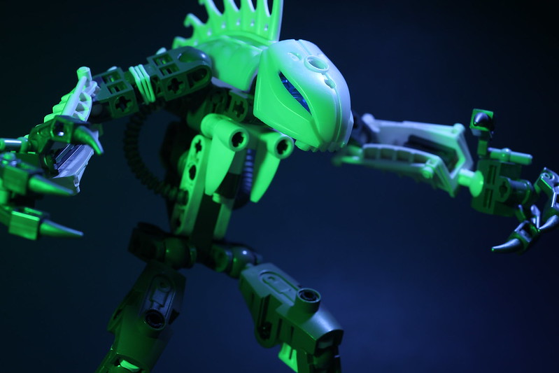 Monster by Brickcrazy, on Flickr

I like the lightning that makes the light green pieces. It's a white Rahksi right?
The hands are also well done, I've tried and failed a couple times to make hands with fingers like that.
I'm looking forward to seeing a test.
I like the lightning that makes the light green pieces. It's a white Rahksi right?
The hands are also well done, I've tried and failed a couple times to make hands with fingers like that.
I'm looking forward to seeing a test.
Thanks, glad you like it. And yes, it is a white Rahkshi (Kurahk, as a few of the more hardcore Bionicle fans may remember). Hopefully I can get a few animations done with it tonight.

This is a work in progress frame from my last short film, before I start working on longer projects. I'm having trouble with chroma keying, as I can't get rid of the outline on the minifig ![]() :
:

Right now, the screen itself is in focus with the minifigure's head, but they are both at different depths. Perhaps consider retaking the shot with the screen in focus and the head out of focus. Alternatively, you could blur the image on the screen to make it fit in better.
Another option is you could take the shot at a different angle, one where the minifigure's head doesn't overlap the screen. The might make it easier to edit, and the framing might look better altogether.

In reference to the keying, does your software have a 'shrink mask' or 'refine edges' feature? those might help, as well as slightly softening/blurring the mask.
You also have some green reflection on the character, maybe adjust the spill correction, or use the 'fix color' setting.
Hey, what do we think:

I'm not sure what I'm looking at, but I really like the lighting effect. If this is a locked down shot, the framing feels a little off with the city(?) in exactly half the frame. I think a little bit more light on whatever is in the foreground might fix this, as making it more visible would make the frame feel more balanced. Of course if the shot is moving that doesn't matter.
thanks backyard.
yes, it is a city, underwater Alantis.
does this look a little better?(this is the final shot, where it moves too...)

what would be good is if you made it a little out of focus so that the light would be fuzzy and it would sell the idea that it is underwater. besides from that it looks great, how did you get the glow effect? Was it a black light?
3ds max.... thats how.
I do plan to us a glow effect to sell it. its just straight for 3ds max. I havent done much at all....
That does look better; it's got me interested in whatever film your working on.
thanks.. wanna see a even better one? sure you do...
Awesome. I loved domed cities of the future.
Posts [ 421 to 440 of 597 ]