Re: Critique My Frame!
I second what rioforce said. There is a lot of headroom, and it would look a lot better, if perhaps the characters were in the centre of the frame.
We are a friendly filmmaking community devoted to the art of stop-motion animation using LEGO® and similar construction toys. Here, you can share your work, join our community of other brickfilmers, and participate in periodic animation contests!
A place to discuss, share, and create stop motion films.

Ad
You are not logged in. Please login or register.

I second what rioforce said. There is a lot of headroom, and it would look a lot better, if perhaps the characters were in the centre of the frame.


Its a nice frame and I agree with the points Rioforce made.
Their seems to be too much dead space and I am also unsure if that was intentional?
Otherwise looks great. Does feel like someone is watching them as mentioned.

So this is a frame from my next project, it's not finished, but I still think it looks nice. What do you guys think?
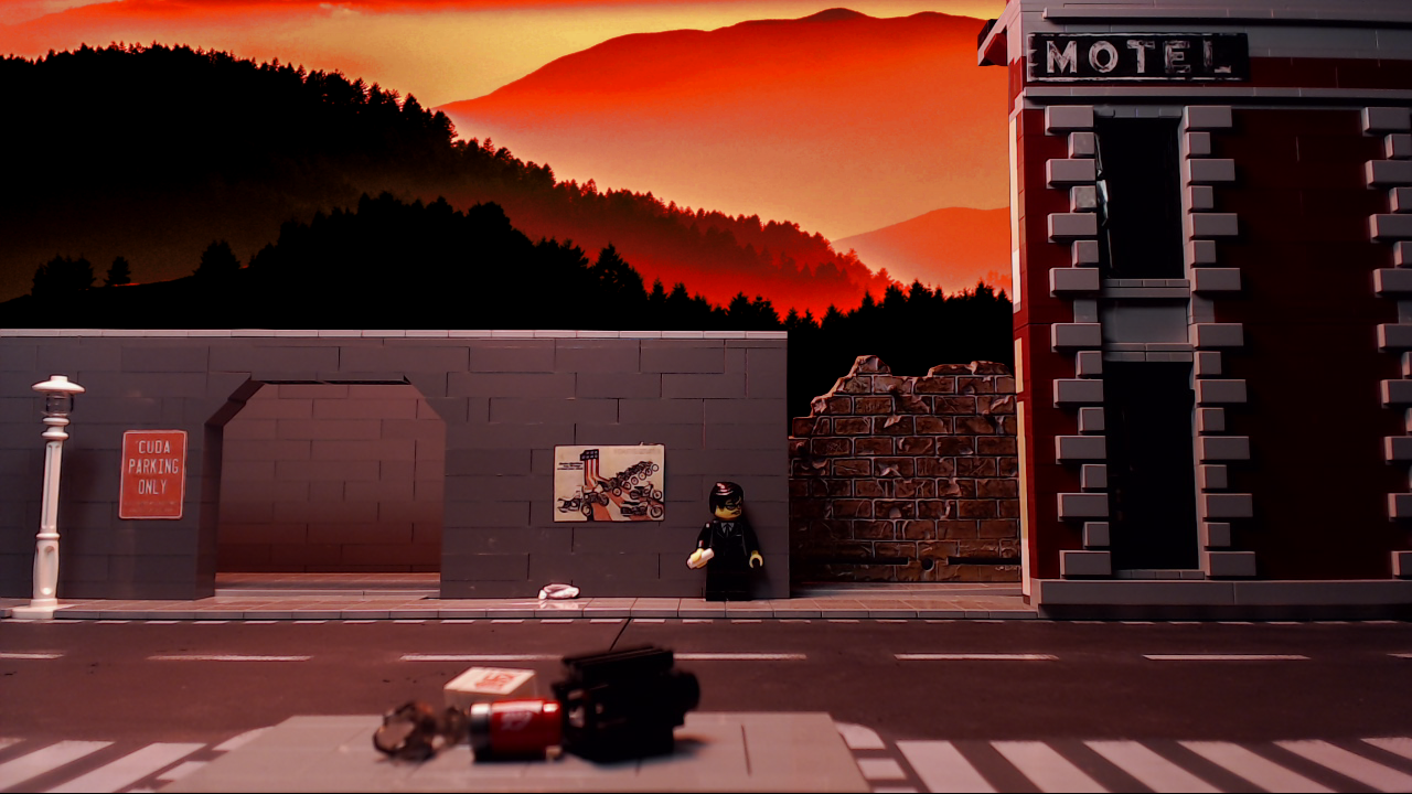

That's a nice background, but the buildings look very flat.
And there is maybe too much contrast on the background, which make it look closer than where it's supposed to be.
I agree with Aiwha on this. It's an otherwise really nice shot. The only glaring problem I can see is the flat buildings. I've been guilty of this in the past - often I won't notice how flat a building looks until I've completed the scene and it's too late. I try to be a bit more careful these days. Other than that, lovely frame. I really like the dark, golden red colour palette and the set, aside from the flatness, looks awesome!
Thanks for the replies! Yeah I agree, I could have made that building on the left look better, it's just supposed to be a parking area, so I thought that would be good enough ![]()

Well, I think they are referring to the fact that the building on the right is obviously nothing more than a façade.
The left building is kinda plain, but has some depth to it at least.
I really like the background. It's awesome, but I'm not sure it fits that well with the buildings right here. It gives the illusion that a few feet behind the buildings the ground slopes away into a valley. Whereas, if the buildings were 3D, and have 'realistic' depth, they would be about to fall down into said valley.
Anyway, the front façade on the right looks really nice, so a little filling in there should fix that all up. ![]()

That frame looks really good! The background and the colors work really well together. I agree with what the people above have said, and I wanted to offer the suggestion of changing the framing around to fix that flat-looking building, rather than adding a whole new wall to the building. Maybe try moving the motel to the left until it is touching the parking area, and move the camera slightly to the right, or until the vanishing point is at least directly in line with the corner of the building. That way, even if there were a wall there, you couldn't see it. It also looks like the motel is sitting flush with the road, which seems kind of odd. I would bring that back to within one stud of the parking area. Also if you move the camera, you might also have to move the road as well if you want to keep the positioning of the debris in the bottom of the frame. Hope some of this is helpful! ![]()

My bedroom. It's missing something - let me know what it is.

btw - how do you get the [ img ] tag to work on these forums?
Also - that aweful radio needs to be a mobile phone. What do you guys use for that?
Cheers!
I did a little research and found out how to embed an image from imgur and edited your post to show it. It's a bit easier from your own control panel when you post it but I found a helpful note online. I can send you the link that helped me in a pm if you are interested.
As for the shot: it looks nice. I think a lot of people use that walkie talkie as a phone. If you are looking for something else to use a 1x2 black tile would be closer. And the trendsetter collectible minifig comes with a printed tile that looks like an iphone.
Hope that helps.
Jared

Nice frame Togfox your pictures are getting a lot clearer, and you have some nice defused light. The bedroom looks a little open right now, if you moved the camera in a little it might fix that, also most bedrooms don't have an outside door . If you don't have a inside door you could do something with tiles. I normally use a 1by2 black tile for a phone. Over all nice frame.
Hope that helps
Looks nice
I use 1x2 black tiles for phones all the time. They're much better than walkie talkies!
I'd hand something on those empty white walls.
Printed posters of those *2* plates (CD covers, etc.)
Thanks legogod - please send me a pm - that way it will be there forever for next time I post an image. I'll look for a 1x2 flat tile.
Thanks Oso. Yeah - outside door - noticed that. Will think about it. You think the shot is too deep? You might be right - I'll play with that a bit.
Thanks Aiwha. That green "tree" on the right was my attempt at breaking up the white walls. It ended up a little outside the shot. But, I agree, I need something on the walls. I'll consider - thanks!!
edit: it just occurred to me - I think it needs a ceiling. That will make it feel more closed and more bedroomy. Agreed?
Last edited by togfox (March 7, 2017 (08:29pm))

The bedroom itself looks pretty good. I would personally make the window much wider (you almost never get windows like that in actual houses unless there's a specific reason), and I might swap out the door but aside from that it's all right.
If I'm perfectly honest, though, the room looks pretty boring. It's serviceable, but forgettable. It helps to think of a set or location not as just a set or location, but also as an extension of the character and mood you want to create. Make the setting reflect what you want the audience to feel. Is the main character happy? Add in bright cheerful colours and high-key lighting. Is she depressed? Make the room look cluttered and disordered to reflect that. Is she sick? Put pill bottles in the background to hint at that. Is she feeling threatened by the caller on the other end of the line? Add in shadowy and dark lighting to create a threatening atmosphere. You can communicate infinitely more through these relatively small and subtle details than you can through just writing it out in the script. Give the audience something interesting to look at, not just blank white walls. I think we can all agree that blank white walls are not very interesting to look at.
Another thing I'd like to point out is the lighting. In my experience many brickfilmers underestimate just how important it is. It's really bright and uniform, which makes everything look kind of flat and bleh right now. It helps to ask yourself where the light would come from in real life and try to recreate that as closely as possible. I would make the window much bigger and have light shine through that, at the very least (unless this is set at night-time), which would make the scene feel much more realistic. Right now it lacks any reference point to where the light is coming from, which makes the whole thing feel staged and artificial. In fact, you have what looks like a lamp hanging above the lady but there is no light shining from it, which looks kind of odd.
In terms the phone, you're probably best off using a black, white, or grey 1x2 tile, if you don't already have a printed phone tile. The walkie-talkie can work, but I'd personally only use it if the scene is meant to be comedic, or it's meant to be one of those massive brick-like phones from the '90s.
Last edited by Mr Vertigo (March 7, 2017 (10:12pm))
Thanks Vertigo - I appreciate the genuine critique. I'm struggling with working out what props to add vs what stock I have in my lego bins, but you are right, I need the room to reflect the character or plot and right now it doesn't.
Your comments about lighting is ironic. I spent a bit of effort removing shadows and was pretty pleased with the even lighting. ![]() But - I've decided to try putting a (half) ceiling on the set and that will force me to rethink the lighting.
But - I've decided to try putting a (half) ceiling on the set and that will force me to rethink the lighting. ![]()
Is this better? (Intentionally dark)


This look a lot better like the ceiling you put in it and the lighting is great
Posts [ 521 to 540 of 597 ]