Re: Drawings and other Art

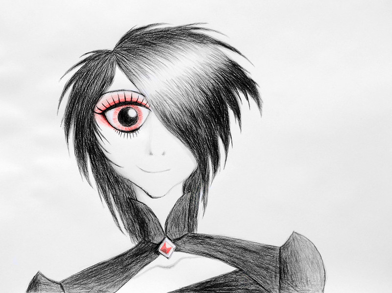
Not bad for a 20min sketch from memory, but I feel it looks massively out of proportion.  The nose looks way too big, the mouth and left eye like they've been shifted over to the left too much, and the eyes are weirdly slanted as well.

Squid wrote:

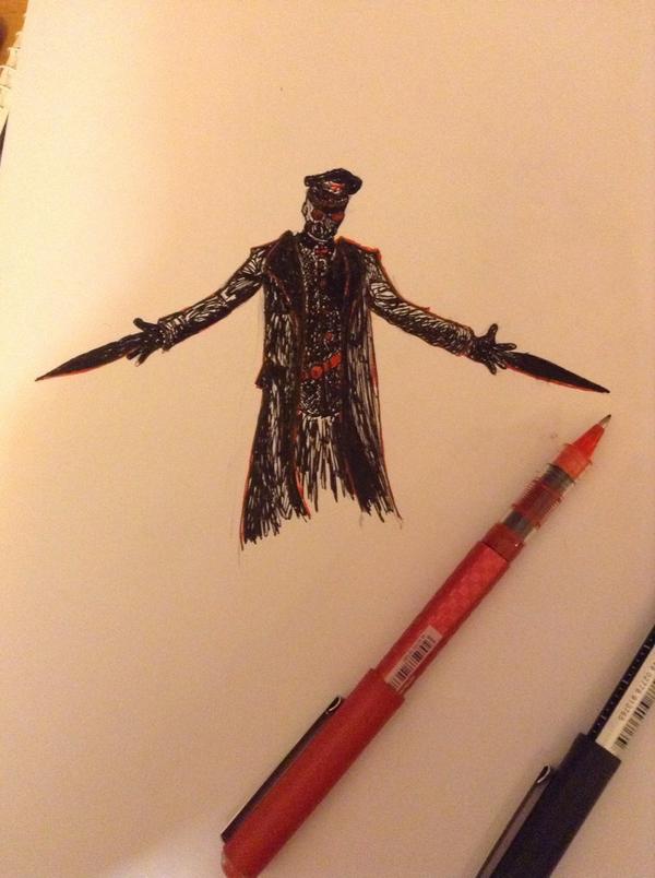
I loved Davy Jones so much.  He was really cool.

Davy?  You're sure you've got the right Jones? mini/lol

Yeah, he's a really cool villain, especially when bandaged up like that.  I'm actually contemplating re-watching Fringe, drawing all these characters has reminded me of how much I love this show.

Your ability to do lighting and texture is excellent, but you seem to have some trouble with proportions which are coming off a little awkward.
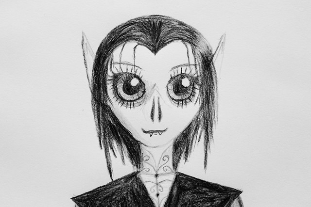
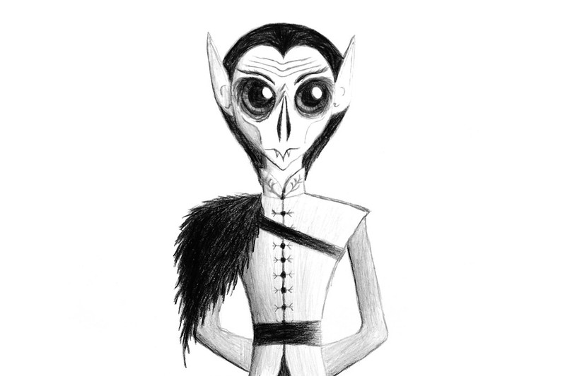
Olivia looks like an old woman.

Thanks!  I suppose she does a bit.  I based it off of this image:

http://www.thegorgeousgeeks.com/images/olivia%20fringe%20anna%20torv%20season%20premiere.jpg

I believe it was from that episode where

Spoiler (click to read)

Olivia gets captured and imprisoned on the Other Side, and Walternate attempts to brainwash her into thinking she's Fauxlivia before she escapes, kidnaps the taxi driver, and goes on the run.

  So I think it's fair to say she'd been through a lot and would look pretty tired.  I did have to shorten her arms a bit to get her hands and gun in the picture, which might make the proportions seem a bit off.

It could also be the way the picture was taken, as I mentioned before it's not really an ideal way of sharing drawings.  For example, if you look at Jones the reflection of the light makes it seem as though he's squinting quite heavily with his left eye, even though he isn't in the actual drawing.

It's quite possible I might re-visit these if I improve my drawing skills--though for now there are many other things I intend to draw, and it will be some time if I do.

Last edited by Mr Vertigo (September 26, 2014 (03:16pm))

Retribution (3rd place in BRAWL 2015)

&Smeagol      make the most of being surrounded by single, educated women your own age on a regular basis in college
AquaMorph    I dunno women are expensive

Re: Drawings and other Art

Redrawing things can be a great way to get better.  I drew Riddlestack and the Outlander twice before posting them.  The improvement was great.  But they still need work.

Anyway, I've drawn yet another character from Riigo-Faloo:

https://farm4.staticflickr.com/3912/15198504167_c571e5fb98_c.jpg

This is Lady Klodia, head of House Kalviri.  She was an important historical figure during the Goblin Era and early Jorvershkart Era (about 1000 years before sharks and clowns).  Though she and Jorvershkart defeated each other, her house remains a menace to Riigo-Faloo.  Luckily, however, House Kalviri is usually busy having conflicts with House Drethis (the other more nefarious vampire house), which has greatly diminished their negative effects on the rest of Faloo.

A little bit more detail on Klodia can be found here: Klodia Kalviri on Flickr

Re: Drawings and other Art

Just saw this on flickr!

Moved an have no room to animate, but I do have a Flickr: https://www.flickr.com/photos/84070766@N07/ My friends and I have been composing a Comic Series: http://cosmosquestcomic.com

Re: Drawings and other Art

I've been working on trying to draw Faloovian goblins:

https://farm4.staticflickr.com/3931/15380026226_496bdae505_z.jpg

I tried to draw a male goblin earlier, but it turned out really bad, but this woman turned out kinda okay.  She's not any specific character, but more of an attempt to get a better idea of how a goblin should look so I can draw some of the other characters.

They look a little like bats, which is ironic considering how much goblins hate vampires.

I'm currently working on a drawing of Professor Aso Kroysterhargen, who's the main goblin character.

Re: Drawings and other Art

Wow, you've massively improved your drawing skills.  I especially like the first one, particularly the red detailing and the way you drew the hair.  Klodia's shading is also really nice, and I really like the method by which you drew the eyes.  Eyes are especially important in any type of portrait.

However, I feel that the eyes themselves in both your pictures are much too huge, and would look much better if they were half the size they are now, perhaps even smaller.  I'd also suggest using a different method of shading Klodia's collar and garment as they look very similar in shade to her hair, and it is somewhat difficult to tell where the hair and clothing starts and ends--I'd suggest shading horizontally and vertically to give the effect of woven cloth.

Also, I think the nostrils on the goblin look disproportionately long, I'd shorten them a bit.  Of course, it all depends what effect you're going for.

Retribution (3rd place in BRAWL 2015)

&Smeagol      make the most of being surrounded by single, educated women your own age on a regular basis in college
AquaMorph    I dunno women are expensive

Re: Drawings and other Art

Thanks!

I do agree without about the eyes being way too big, that was more accidental than intentional, as I'm still bad with proportions and I need to practice at that.
I do, however, not want to make them too small.  I'm trying to develop a specific character style for Riigo-Faloo which is not entirely realistic, and yet not too far wrong.  Something like Gravity Falls has really disproportionate and oddly shaped characters when compared to humans, whereas something like Avatar has something significantly closer (though still quite off).  I'm trying to find that happy medium for Riigo-Faloo, whatever it is, though I do know I still want the eyes to be at least somewhat large.  As for exactly how large and what exact shape I'm not sure, but I want it to be relatively consistent throughout the characters.
Though, it is worth noting that goblins have different eyes from other races in Faloo, as they have very large irises which prevent anyone from seeing the whites of their eyes, kinda like how one can't usually see the whites in the eyes of a deer or a dog.

And speaking of big eyes, I've finished my drawing of Aso Kroysterhargen, who's eyes are still a bit too big:

https://farm4.staticflickr.com/3928/15219156549_2ef6a80043_c.jpg

Professor Kroysterhargen is one of the main heroes of Riigo-Faloo, which in the story are sometimes called the Fellowship of Vakrilan.
I put a little bit more description about him on Flickr

Though this picture is greyscale, I'm having trouble deciding what colour Aso's eyes should be.  I'm choosing betwixt orange or purple.
If I go with purple, then his eyes will match some purple in the three main clown characters (Comrigone, Elobel, and Twilig) who use purple a extensively in their designs.  But if I got with orange he'll match better with Bliit's hair and Sur Jargon's right eye (the other being blue).
I digitally altered this picture for a comparison betwixt the two options here.

What do you guys think?

Re: Drawings and other Art

Well, all you have to do is draw smaller circles for eyes, it's not that difficult.  But I'd certainly recommend experimenting with different styles to see what you like.  You could try looking at different styles of comics and cartoons to see which style you like best, and perhaps try blend different styles or use it as a base to create your own unique method of depicting characters.

I much prefer small-ish eyes.  Personally, I tend to find disproportionately large eyes in an otherwise fairly normally proportioned body to look weird and disturbing--which is why I usually find excessively chibi/"cute" anime/manga or MLP ponies, for example, uncomfortable to look at.  (Of course, it could be that I'm just really weird in that regard.)  Though, I do really enjoy drawing characters with round glasses or goggles and making them a solid colour, giving it a kinda stylised and surreal look, or making it seems as if light is reflecting off them.  Mike Mignola, for example, tends to do this.  I really like his style of drawing.

Speaking of which:

https://pbs.twimg.com/media/By010TaIcAErW-F.jpg

Karl Ruprecht Kroenen.

I was up at 2 AM last night and couldn't sleep so I drew this (y'know, like totally normal people do).  It's very quick and rough, and certainly not my best work, but it's probably one of the first ink drawings I've attempted, so I'd like to get some feedback if possible--thoughts?

Last edited by Mr Vertigo (October 1, 2014 (12:15pm))

Retribution (3rd place in BRAWL 2015)

&Smeagol      make the most of being surrounded by single, educated women your own age on a regular basis in college
AquaMorph    I dunno women are expensive

Re: Drawings and other Art

Looks good! The hat looks off, but thats a nitpick if this was done fast.

Re: Drawings and other Art

That looks pretty good.  I too really like goggles or mask things like that.  The left thumb looks a tad odd, though.

I'm really fond of drawing stuff with ink.  The big problem though being that it's hard to shade, but I really like how the pen goes so smoothly across the paper and one does not have to worry about about the problem of pencil tips changing shape all the time which can lead to errors.

Re: Drawings and other Art

I prefer drawing with pencil.  Pencil is a lot more forgiving than pen, plus it's much more versatile in terms of what can be accomplished in methods of shading and drawing lines.  Plus, one can't erase pen, and, worst of all, it can smudge quite easily (I completely ruined a drawing when I accidentally smudged a tiny bit of ink once).  But yeah, I love the feel of ink on paper (I much prefer writing with pens than pencils), and pen drawings can look amazing.  However, I intensely dislike cheap gel biros/ballpoints (liquid ink all the way).

Anyway:

https://farm4.staticflickr.com/3933/15286108208_d5aa42d435_z.jpg
Mummified Mermaid by FlyingMinifig, on Flickr

"June 1887: Specimen captured by a Norwegian whaler off the coast of Greenland.  Specimen died soon after discovery.  Its body has been preserved."

Another ink drawing I've made.  I'm not sure if it's a bit of a WIP; I might add a proper background yet.  Quite pleased with this one, although I feel the colouring might be a bit uneven (it's difficult to fill out solid blocks of colour with fine-line pens) and I think the bottom of the tank/mermaid's tail may be a bit dark.  I aiming for a very Mike Mignola/Guillermo del Toro-esque feel for this one.

Retribution (3rd place in BRAWL 2015)

&Smeagol      make the most of being surrounded by single, educated women your own age on a regular basis in college
AquaMorph    I dunno women are expensive

Re: Drawings and other Art

http://fc07.deviantart.net/fs71/i/2014/284/f/d/flower_by_itwashissled-d82dvub.jpg

Another flower! I wasn't supposed to shade it, but I did. So, perhaps later I'll be drawing another that isn't shaded. Here are some other drawings I've done over the last week or so.

http://fc00.deviantart.net/fs70/i/2014/281/c/7/hand_by_itwashissled-d821n3y.jpg

http://fc05.deviantart.net/fs70/i/2014/281/a/a/fedora_by_itwashissled-d821mcl.jpg

"[It] was the theme song for the movie 2010 first contact." ~ A YouTuber on Also Sprach Zarathustra
CGI LEGO! Updated occasionally...

Re: Drawings and other Art

No feedback for my Mermaid? mini/confused  (Is it really that bad? mini/tongue )

Not bad, but the drawings look a bit flat.  Try creating a bigger contrast when shading.  Also, the lines on the hand look very flat and two-dimensional, and you can see the pencil lines quite clearly in your shading of the hat.  Smudging with your fingers works very well for obscuring noticeable pencil lines and creating a smoother finish.  Looking at actual pictures whilst drawing the object helps a lot, as you can pick out subtle details that you would not be aware of if drawing purely from memory.

Anyway, got myself a new set of pens and decided to bring you your daily dose of Death Note fan-art:

https://farm4.staticflickr.com/3927/15333576678_da3568af35_z.jpg
L by FlyingMinifig, on Flickr

Not very pleased with the skin tone, and for some reason some of the lines I drew seem to have a weird "grainy" look, especially around the face, but I think it turned out pretty well.

Last edited by Mr Vertigo (October 13, 2014 (01:24am))

Retribution (3rd place in BRAWL 2015)

&Smeagol      make the most of being surrounded by single, educated women your own age on a regular basis in college
AquaMorph    I dunno women are expensive

Re: Drawings and other Art

Looks nice! How long it take you to draw and colour?

Re: Drawings and other Art

It looks a lot like L, but your are right that the skin tone is really off.
It would probably have been a little safer to just leave his skin uncoloured, as really soft tone's like L's are really hard to get right.

L is mostly a very light grey with only the tiniest bit of a sort of green saturation.

Re: Drawings and other Art

https://33.media.tumblr.com/16b15b73499f428ea73099f7565319e0/tumblr_nd5hqinFOr1rl6rtxo1_500.png

Not all that polished, but whatevs. It's honestly one of the best little doodles ever to grace a margin of mine, which honestly isn't saying much but hey what are you gonna do

(This lil' guy isn't in the new Smash, and I'm a bit disappointed.)

http://i.imgur.com/Q9NCUnx.png

Re: Drawings and other Art

Slurping Animations wrote:

Looks nice! How long it take you to draw and colour?

It kinda depends.  I don't really time myself, since I tend to work on drawings on-and-off, depending on how motivated/in the mood I feel.  This one was pretty quick, probably around 1 and 1/2 to 2 hours (though this is a just rough guess).

Squid wrote:

It looks a lot like L, but your are right that the skin tone is really off.
It would probably have been a little safer to just leave his skin uncoloured, as really soft tone's like L's are really hard to get right.

L is mostly a very light grey with only the tiniest bit of a sort of green saturation.

Yeah, it was the closest colour I had, though it did turn out darker than I thought it would be.  It would have looked weird leaving the face plain white though, since the shirt is also white, and the rest is colourised.  I guess I might have to go for subtle shading with pencil-crayons in the future--or just do monochrome drawings, like the original Manga, barring a few panels (which I actually might do).  (Just now I also noticed his face looks a bit elongated and out-of-proportion, which is really beginning to aggravate me as well.  And I also forgot to colour in a patch below his armpit... oh well.)

Retribution (3rd place in BRAWL 2015)

&Smeagol      make the most of being surrounded by single, educated women your own age on a regular basis in college
AquaMorph    I dunno women are expensive

Re: Drawings and other Art

http://33.media.tumblr.com/8678a5748ef48069ac7356535bfc891d/tumblr_ndk0feg5KW1szxj2po1_1280.jpg

https://i.imgur.com/IRCtQGu.jpg

Re: Drawings and other Art

It's beautiful.  It looks really creative and imaginative.

Re: Drawings and other Art

https://farm4.staticflickr.com/3934/15636058492_b2e7f30a38_c.jpgLEGO Universe's Fourth Birthday by rioforce, on Flickr

This would belong in the "other Art" category. mini/wink I made this 3D render of LEGO Universe's Avant Gardens in honor of it's fourth birthday. (Unfortunately, LEGO Universe is not around today because LEGO closed it down in January of 2012). Enjoy. I built the microscale myself, and everything (except the LEGO Universe logo) I also made.

YouTubeWebsite
https://bricksafe.com/files/rioforce/internet-images/RioforceBiMSig.png
"Whatever you do, do all to the glory of God." - 1 Corinthians 10:31b

Re: Drawings and other Art

http://i885.photobucket.com/albums/ac51/dewfilms/pics/drawings/PA270431.jpg
Rocket Raccoon

"Tell stories that matter to you, not stories that'll sell." - Stephen Tobolowsky

YouTube/Twitter/SG