Re: The Movie Poster Thread [Large Images]
Lovely poster, Blue Ghost. It's great to see that you're working on a new film.
We are a friendly filmmaking community devoted to the art of stop-motion animation using LEGO® and similar construction toys. Here, you can share your work, join our community of other brickfilmers, and participate in periodic animation contests!
A place to discuss, share, and create stop motion films.

Ad
You are not logged in. Please login or register.

Lovely poster, Blue Ghost. It's great to see that you're working on a new film.

Looks cool! Now to wait 3 years for it to come out! ![]()

Poster for my upcoming series.

I don't recommend using stock-photos to make a poster. Since your series is stop-motion, it should use real photos of minifigs, not animated renders that were made for the official LEGO advertisements. It is very misleading.

Here's one for my new Sci-fi Movie

Tell me what you think.

Blue Ghost,
That looks great! Can't wait to learn more about this film.
Too bad it's so far out, 2018 is a long wait.
Antonio,
You may want to try not using obvious promo pictures. The composition looks fine, but mixing a real-life picture with CGI Lego figures just doesn't mesh well. (Especially since some figures are bending in odd ways, while others are not.)
Perhaps you should get deeper into production and wait until you have some footage to pull elements from before getting a poster together.
Tim,
I think the biggest issue is the fact that something doesn't stand out that should. The title, and the date.
The text is pretty small and isn't made distinct from the background. You see all that empty space at the top of the poster? The title should be filling most of that. People need to be drawn to the necessary information like the date and title, yet in this, placement and presentation-wise, they seem like last-second afterthoughts.
They need to be bigger, to stand out more, and to make use of all that empty space. Plus, the overlap in different colors and fonts just makes it that much more unreadable and unprofessional. It's like you forgot to delete that layer in Photoshop, and didn't bother to fix it later.
What I do like is the fading out to black, paired with the (upsidedown... ![]() ) studs on the wall. The lighting looks cool, and makes use of the Lego aesthetic. BUT, the rest of the set is kinda random, with different floor colors, some empty space in the middle with all the characters nearer the bottom or sides, and an overall feel in unfinished-ness. If you want a division of the set, say with the light and dark grays, make sure there is a reason for it, and that it happens in the middle of the poster, not off to the side. Plus, the camera's slightly crooked.
) studs on the wall. The lighting looks cool, and makes use of the Lego aesthetic. BUT, the rest of the set is kinda random, with different floor colors, some empty space in the middle with all the characters nearer the bottom or sides, and an overall feel in unfinished-ness. If you want a division of the set, say with the light and dark grays, make sure there is a reason for it, and that it happens in the middle of the poster, not off to the side. Plus, the camera's slightly crooked.
You need to stuff everything closer together, make the poster narrower, make use of the emptier spaces at the top and bottom for more noticeable and readable text, and work on the composition and balance of all of the elements.
It is Weird looking, I didn't really know what I was doing I am making a new one and I'll post it here.
Last edited by Smocktopus (May 8, 2015 (08:55am))

I made this almost a month ago as a bit of fun (hence the partially-dodgy focus - this was more of a happy-snap) but now that I have about three minutes animated, I thought I may as well post it here. It's more of a wallpaper than a poster (the dimensions are right for a wallpaper).
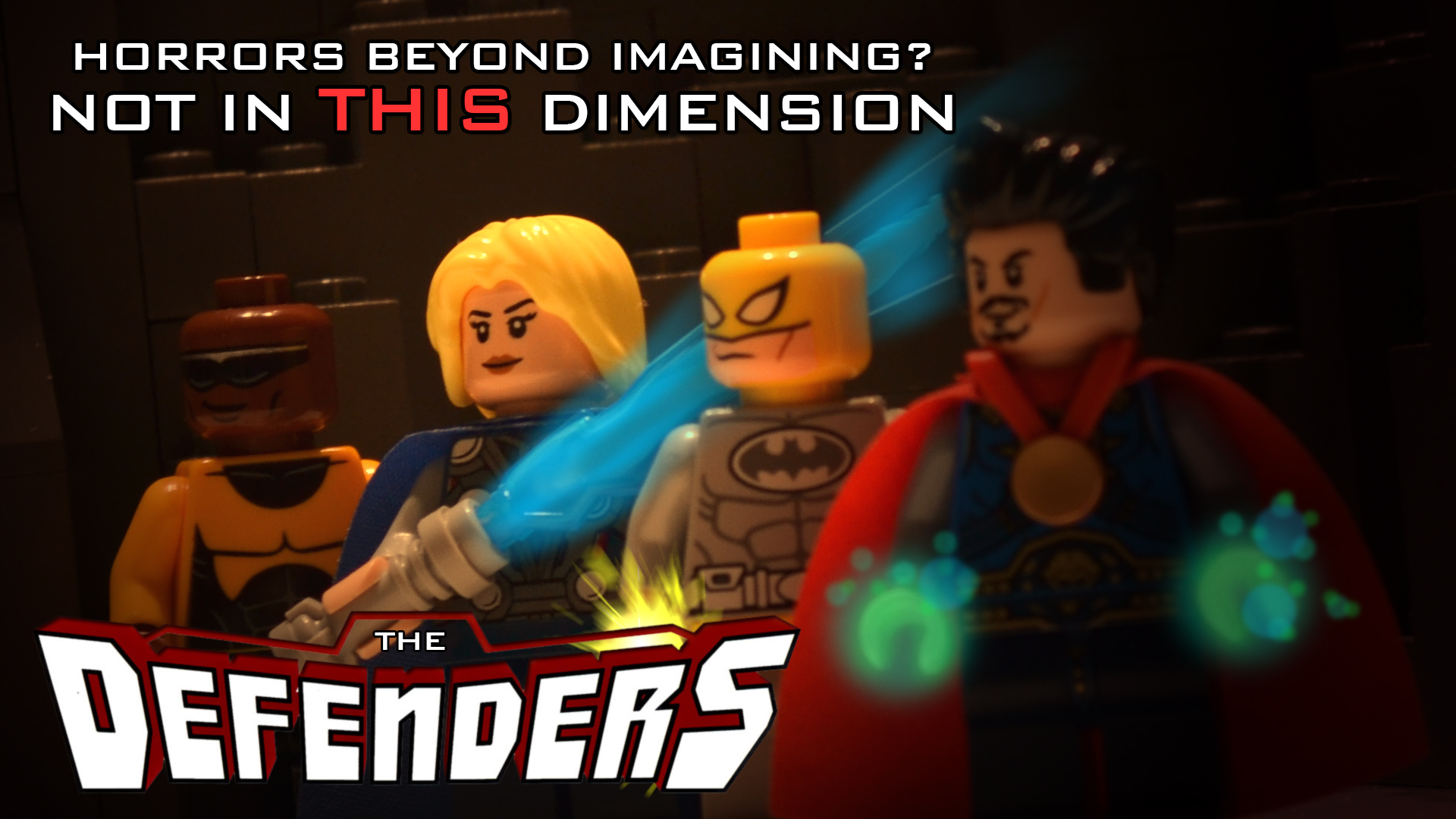
From left: Luke Cage, Valkyrie, Iron Fist, Doctor Strange (now that I'm doing this for real, Luke Cage may not even be in the final brickfilm). It's honestly a weird animation so far, skipping from New York to the Himalayas to Romania, with vampires, Sub-Ultrons and naked werebat demons in between. Once I've got more of it done, I'll make some character posters too.


2nd Poster! Tell me what you think

I like the picture you used for the background, but the text isn't that great.
For such a minimal piece, there should not be as many different text colors as there are. I think even just one is good enough. The size of the text is too small. You want to make sure that it is big enough to be easily read.
That was as big MS Paint would let me make them.

 "Answer the call" by Canaan May, on Flickr
Avengers: Eternal Winter coming sometime 2015

I already posted this in my product thread but I'm really proud of this poster
My latest film!

Straight outta Compton comes out Friday, so in honor with what everyone else on the internet is doing, I made a similar poster for episode 3 of my Spider-Man series.


My D&L entry. Out on Tuesday, September the 1st!
Last edited by William Osborne (August 23, 2015 (06:34am))
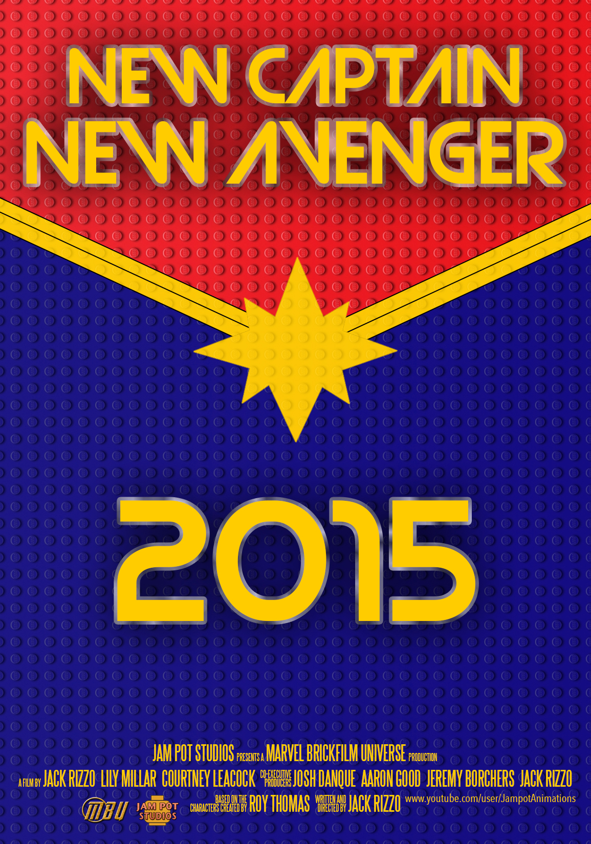
There's a project I'm hoping to begin production on before the end of the year. It's a Captain Marvel miniseries for the MBU, and I'm aiming to make three episodes (one full story arc) to test the waters; see if it's well received, and see how much how enjoy making it. Anyhow, this is a very early poster that I whipped up last night, since I currently can't do any animating. I'm not particularly good at making posters but I think this is a vast improvement on some of my previous attempts. The tagline "New captain, new Avenger" refers to how Carol Danvers is assuming a previous superhero's title, and her need to live up to the title will be one of the series' themes. There were other taglines, but I thought this was the best version in the end.
It's still a way off yet, as there's stuff I need to get on with first (cough cough Avengers Unconquered E01 cough cough Vampire Egress cough cough) but pre-production (including creating posters like this) has already begun.
Looks pretty good to me ![]()
Posts [ 1,201 to 1,220 of 1,267 ]