Re: The Movie Poster Thread [Large Images]
Tiny little uk teaser poster

My Film Review blog http://funmismoviereviews.blogspot.ca/
My artwork http://funmiproductions.deviantart.com/
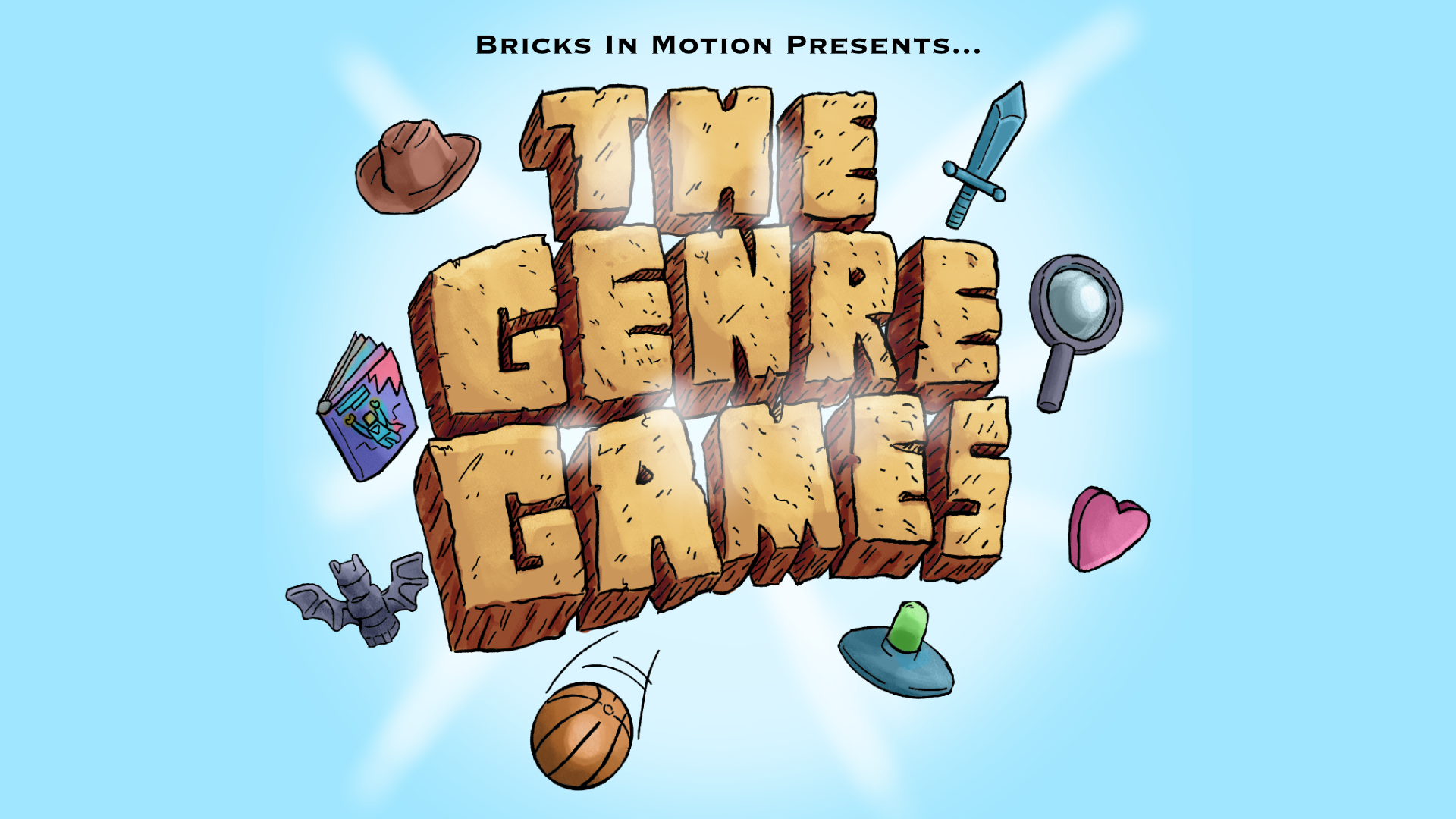
We are a friendly filmmaking community devoted to the art of stop-motion animation using LEGO® and similar construction toys. Here, you can share your work, join our community of other brickfilmers, and participate in periodic animation contests!
A place to discuss, share, and create stop motion films.

Ad
You are not logged in. Please login or register.

Tiny little uk teaser poster

Awesome poster, Dylan! Can't wait for Friday.
Oh, wait...

/
Last edited by Legocloniac477 (April 30, 2021 (02:42pm))
Nice poster, Cloniac. The red background is nice, and I like the shadows of the weaponry. The title is nicely centered, and it looks like a real movie poster. My only gripe is that it's a little slanted. Probably intentional, but it can be a little distracting. It's an interesting design, however, to slant it a bit.
I disagree. It fits in well with the way the guns are positioned. Nice looking poster though

I don't know. I can see how positioning it to fit with the guns might not look good. Then again, making the text level might not look good either. But then again, having it in between looks a little unusual as well.
Besides that, it's a creative poster design! I like it. Also I'm sad it's not an existing film. Please don't get me excited for films that don't yet exist. ![]()

Thanks guys, I'll make a few corrections and see how they look. I originally had the title at the same angle as the minifigure but it was too extreme an angle for something that needs to be read. So I tried to find a middle ground between angle and straight, while still being readable.
Please don't get me excited for films that don't yet exist.
Sorry, hopefully it will exist eventually.

I think it looks pretty cool. I really like the feel the slant and red background gives.

/
Last edited by Legocloniac477 (April 30, 2021 (02:41pm))

That's pretty cool, but really hard on the eyes. Maybe tone down the red a bit, make it more maroon so it is easier to look at.
Yea I think I like the red better for the bacround. But the rest looks really cool.

It has pretty good composition but I don't understand why you put the before and after. Seeing the frame without effects, points out where the effects fall short. The keying is not good, but the rain effects are marvelous. It's sharp, I like that.
thats a very good point Legoclonic.... I'll keep it in mind... well, the finished film is here if you wanna watch it: https://www.youtube.com/watch?v=Du7kXo7dmds

I don't understand why you used a green screen, that back ground should have been easily created without a green screen
I actually animate in a storage room, so the background would have been ugly.
All you really needed was a grey background with a color change at the bottom, even just a grey backdrop would have looked better then a poorly chroma-keyed set expatiation. When I use green screening I find I get the best results with the aperture stopped pretty far down, that way the line between my subject and background with turn out better. Although as this is a poster you could have just removed the offending area with a nice feathered mask. If an edge in a key turns out badly sometimes you just have to bite the bullet and mask it out by hand.
yeah, i did much better with the next key in the film..... certainly a poor choice of a frame to show off.....
yeah, i learnt alot about masking on that video... next one wont have much if any in it anyway......
My best poster effort so far.
Posts [ 1,161 to 1,180 of 1,267 ]