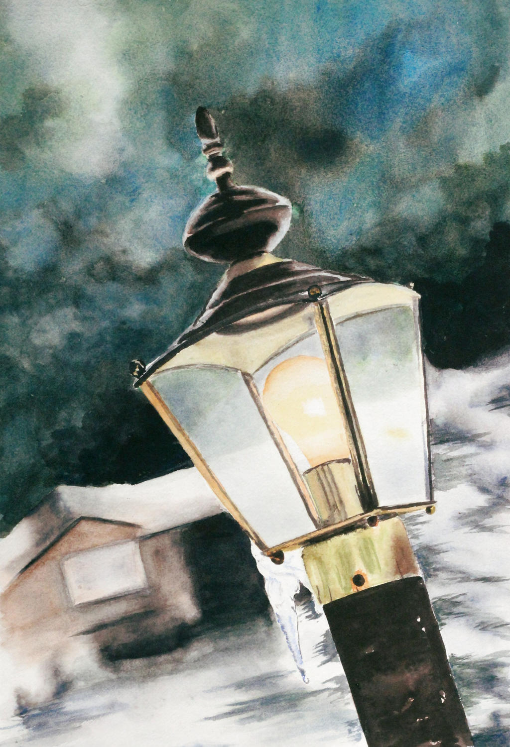
For the most part, the lamp's geometry is well done, Mighty Wanderer. The perspective lines are very convincing of the thing's depth. However, there are a few details such as the top knob is tilted slightly, as is the pole on the bottom. Also, the bolt on the top right corner could be more pronounced, as it is lost in the darkness of the background. In fact, that is a very noticeable flaw in this piece. The separation between foreground and background is hardly striking. It's difficult to tell exactly what is what. So while the lantern itself is pretty well depicted (lines, shape, color, and tint/shade detail), the piece as a whole is lost a little in the scramble to figure out what is going on. I think if there was the same amount of attention to detail in the background as there was in the lantern it would have been more solid of a final product. All of that being said, I like the play of color in the sky. It's kind of dreamy and vague and I personally really like looking at it.
This is a good painting and I look forward to seeing more.
"I wear black even when I'm not animating. I'm like a walking funeral parlor."
-PushOverProductions